Image Manipulation
Image Selection
Subject Matter
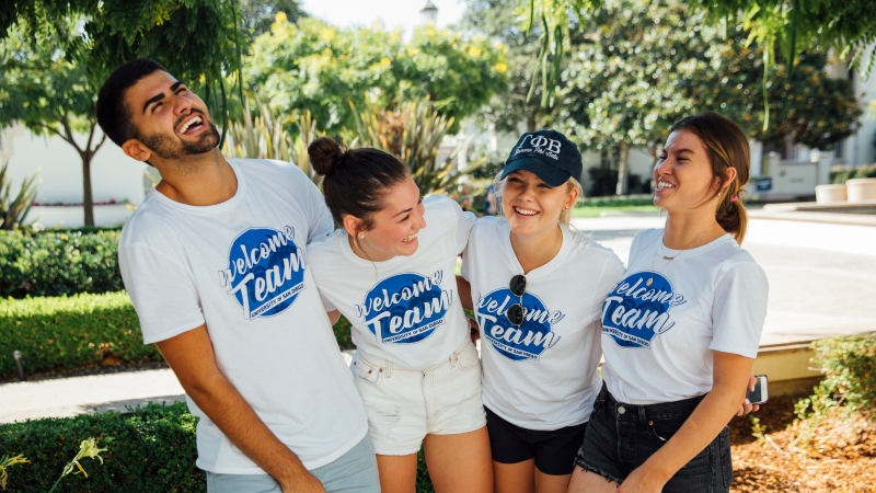
The subject matter and placement of the subjects in your photo should always represent those subjects and USD with dignity. Avoid "creeper shots" and anything that may be embarrasing to the subjects if placed on one of our webpages. This guideline isn't to pass judgement or on how our faculty, staff, and students choose to represent themselves, but is intended to always err on the side of respect and caution for those that any amount of publicity may affect.
Size
- Images should not be enlarged. Never select an image that is smaller than its plot. Enlarging an image makes it appear grainy.
- Images that perfectly fit their plots are best.
- Images that are larger than their plots are acceptable.
- Widths should be larger than heights.
Clarity
Clarity can best be viewed by "zooming in" on a vector graphic and comapring it with zooming in on a rasterized image.
For examples of images with poor clarity, view the page on broken images.
Intellectual Property
As tempting as it may be, do not grab images off of Google or anywhere else on the Internet. Use the USD Gallery link above to access images for use on USD webpages. Only photos in folders marked public are for use without the need to gain permission.
Brand
One of the largest concerns for USD is branding. Each school and major department covets a distinctive brand. Please make sure your image selections fall within the scope of your school's or department's branding.
Subject Placement
Below, the Rule of Thirds and headroom are covered as simple guides on how to better select an image with a subject or subjects in alignment with your plot, resizing, and cropping.
Photography Guide
For more examples of how USD websites use photographs, visit the Brand site. For a good article on common photo mistakes, check out this page.
Aspect Ratio Dimensions
Select a sensible aspect ratio for your images. Listed below are the recommended sizes. If you're unsure, try starting with the XL size and see if that works for your needs.
Landscape
Landscape
For images which are wider than they are tall, like movies on a TV screen or when you turn your smartphone sideways:
"Wide" - Aspect Ratio = 16:9 for modern TVs and monitors, often used on USD websites for "banners" which stretch across the entire page
- Extra Large: 1120x630
- Large: 960x540
- Medium: 800x450
- Small: 640x360
"Standard" - Aspect Ratio = 4:3 for slightly wide images closer to a "box" shape
- Extra Large: 1120x840
- Large: 960x720
- Medium: 800x600
- Small: 640x480
Square
Square
For images which are just as wide as they are tall, typically used for images intended to be clickable "buttons" or a series of images intended to be closer to several thumbnails, often called "tiles":
"Square" - Aspect Ratio = 1:1 for buttons or tiles
- Extra Large: 1120x1120
- Large: 960x960
- Medium: 800x800
- Small: 640x640
Portrait
Portrait
For images which are taller than they are wide, typically where the subject is a human whose entire body fills almost the full image:
"Full Screen" - Aspect Ratio = 9:16 for smartphones
- Extra Large: 630x1120
- Large: 540x960
- Medium: 450x800
- Small: 360x640
"Standard" - Aspect Ratio = 3:4 for slightly tall images closer to a "box" shape
- Extra Large: 840x1120
- Large: 720x960
- Medium: 600x800
- Small: 480x640
Extra Large "XL" - 2100x900 - 7:3 Aspect Ratio - Usually Used for Banners
Presented in Cascade here using a Media Component with its "Image Shape" set to "Auto." The Media Component is under a Container Component which has set the page's content for this section for the Grid Layout to "One Column," and the Content Width to "Full Width."
Large - 960x540 - 16:9 Aspect Ratio - Usually Used for Sections or Main Content
Presented in Cascade here using a Media Component with its "Image Shape" set to "Auto." The Media Component is under a Container Component which has set the page's content for this section for the Grid Layout to "One Column," and the Content Width to "Contained."
Medium - 800x450 - 16:9 Aspect Ratio - Usually Used for Images Within a Section on the Page
Presented in Cascade here using a Text Component where the image was placed within the Content field. The Text Component is under a Container Component which has set the page's content for this section for the Grid Layout to "Two Columns," and the Content Width to "Contained."
Small - 640x360 - 16:9 Aspect Ratio - Usually Used for Buttons, Card Components, or Small Images Within a Section on the Page
Presented in Cascade here using all of the same settings as the previous image. This is just in a second Text Component.